MTA Subway Diagram Redesign
MTA Subway Diagram Redesign
MTA Subway Diagram Redesign
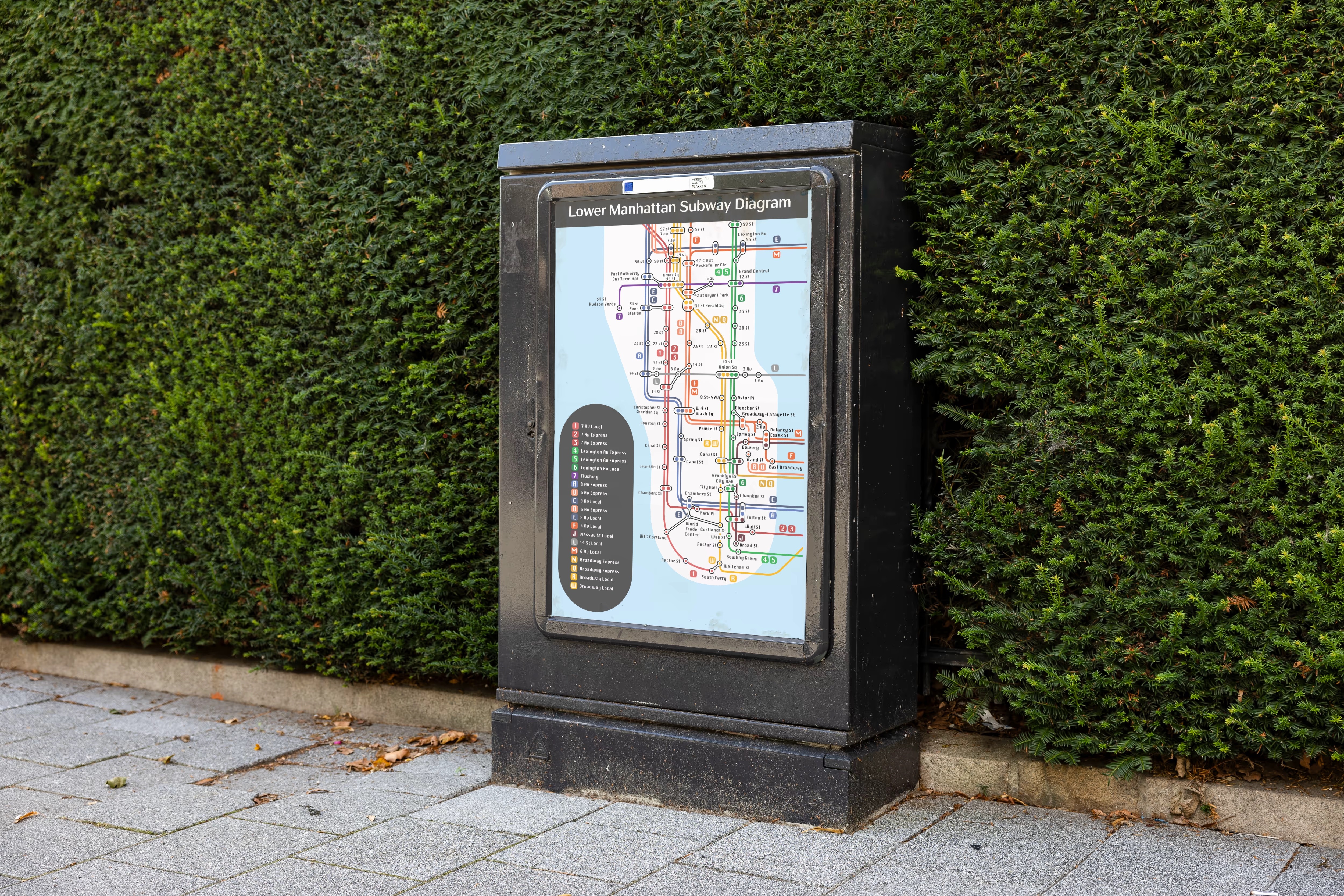
As a New Yorker myself, the MTA subway diagram often feels convoluted and overwhelming. Although it is one of the most consulted transit maps in the world, its current design creates unnecessary confusion.
My redesign addresses existing challenges by prioritizing clarity and accessibility. By refining the visual hierarchy, simplifying complex intersections, the new system would allow riders to navigate with confidence, transforming a frustrating experience into an intuitive one.
OLD DIAGRAM (top)
NEW DIAGRAM (bottom)
OLD DIAGRAM
OLD DIAGRAM (top)
NEW DIAGRAM
NEW DIAGRAM (bottom)

Ways the new design solves the problem of legibility:
Ways the new design
solves the problem of legibility:
Ways the new design
solves the problem of legibility:

Increased readability by creating more distance between each of the train lines. As well as removing background streets and landmarks. These factors would allow the viewer to better focus on the lines and mitigate visual fatigue.
Increased readability by creating more distance between each of the train lines. As well as removing background streets and landmarks. These factors would allow the viewer to better focus on the lines and mitigate visual fatigue.
Improved Visual Clarity & Density
Improved Visual Clarity & Density
Visual Clarity & Density

Brighter tints of the existing MTA color palette were used to improve accessibility for riders on the move while preserving the familiar colors daily commuters rely on. Drastically altering the palette could create confusion, as many riders strongly associate specific colors with specific train lines.
Brighter tints of the existing MTA color palette were used to improve accessibility for riders on the move while preserving the familiar colors daily commuters rely on. Drastically altering the palette could create confusion, as many riders strongly associate specific colors with specific train lines.
Brighter tints of the existing MTA color palette were used to improve accessibility for riders on the move while preserving the familiar colors daily commuters rely on. Drastically altering the palette could create confusion, as many riders strongly associate specific colors with specific train lines.
Color Differentiation
Color Differentiation
Color Differentiation

The new diagram uses bold, simplified icons to clearly indicate stations and transfer points. This makes it easier to understand where each train stops and how lines connect. By reducing visual distractions, the diagram allows fast-moving commuters to navigate the system more efficiently and confidently.
The new diagram uses bold, simplified icons to clearly indicate stations and transfer points. This makes it easier to understand where each train stops and how lines connect. By reducing visual distractions, the diagram allows fast-moving commuters to navigate the system more efficiently and confidently.
Improved Wayfinding Symbols
Improved Wayfinding Symbols
Visual Clarity & Density